Other types of data display
The following types of diagrams are popular tools among epidemiologists since they do not only show quantitative data but relationships within the data and abstract information.
Contents
Scatter plot
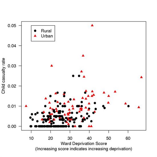
The scatter plot (also called as scatter graph, scatter diagram or scatter chart) is a type of diagram which displays the relationship between two - either discrete or continuous - variables. One variable is plotted on the x-axis while the other is plotted on the y-axis. Their intersecting points can graphically show relationship patterns, e.g. negative correlation, positive correlation or no correlation. It is important that all data points should be shown, which can be difficult when there are coincident points. Different symbols can be used to indicate subgroups of the data [1]. Most often a scatter diagram is used to prove or disprove cause-and-effect relationships between two variables. On the other hand it does not prove that one variable causes the other. A one way scatter plot may be used to display a single continuous variable, but a disadvantage is that the plot may be difficult to read if too many points lie close together. [2]
Below is a scatter plot of child casualty rates by ward of collision. Child Casualty rates plotted against ward deprivation score, aggregated by the ward in which the collision occurred, casualties reported injured in Devon 1996-2002. Source: Hewson. BMC Public Health 2004 4:15 doi:10.1186/1471-2458-4-15
Box-and-whiskers plot
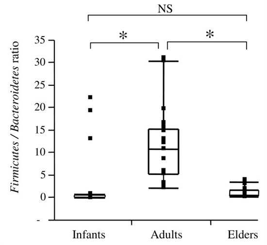
Box-and-whiskers plots are suitable for showing statistics derived from continuous data. A box plot is a good alternative or complement to a histogram and is usually more suitable for displaying several comparisons parallel to each other. The box plot graphically displays the lowest value (minimum), highest value (maximum) and median value in the dataset, as well as the size of the first and third quartile. A box plot is a good alternative or complement to a histogram and is usually more suitable for displaying several comparisons parallel to each other. Lines projecting out from the box may be added ("whiskers", thin lines) to display more extreme parts of the distribution of values. [2] Sometimes any values outside the range of the whiskers are plotted individually. [3]
Below is a box-and-whisker plot of Firmicutes/Bacteroidetes ratios in three age-groups. Horizontal lines represent the paired comparison. Boxes contain 50% of all values and whiskers represent the 25th and 75th percentiles. Significantly different (P < 0.05) ratios are indicated by *, while NS corresponds to non-significant differences. Source: Mariat et al. BMC Microbiology 2009 9:123 doi:10.1186/1471-2180-9-123
Forest plot
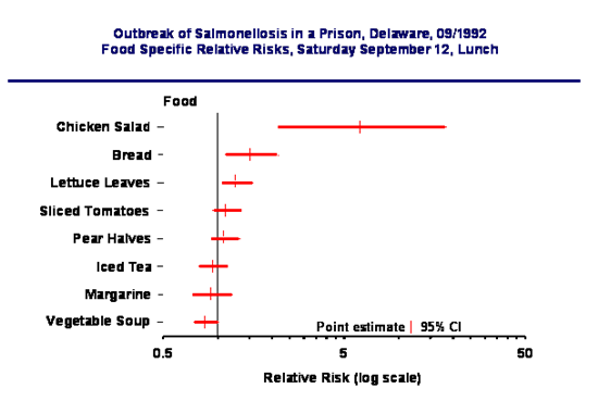
Forest plot is a convenient way of presenting a number of means and their confidence intervals in a graphic manner, so that they can be easily reviewed and compared. [4] In systematic reviews containing meta-analyses it provides a simple visual representation of the amount of variation between the results of the studies, as well as a pooled point estimate of the overall result of all the studies together. Forest plot is essentially a number of horizontal lines with a circular dot or square in the middle. The dot or square shows the mean value, the horizontal line shows its confidence interval - usually, but not always 95% confidence interval. [5] Forest plot is mainly used to present the differences or ratios between two groups in a number of studies. Usually therefore there is a central vertical line which represents the null hypothesis. Where differences between means are presented, null has the value of zero (0) and the x scales are normal. Where ratios are presented (e.g. Odds Ratio), null has a value of 1 and the scales are logarithmic. [4]
Source: Denis Coulombier, an outbreak of salmonellosis in a prison, Delaware, 09/1992, presented at the EIS conference, CDC, Atlanta, April 1993.
Radar chart
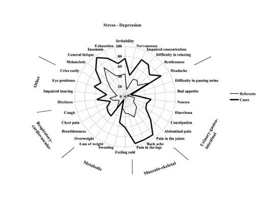
A radar chart (also known as spider chart, web chart, polar chart, and irregular polygon) displays data of several numerical (quantitative) variables in a graphical way that makes quick and easy to visualise highs and lows in the data, as well as similarities and differences between the variables themselves. Each axis represents a different category, while data belonging to a given variable visually form a star-shaped figure. Point zero is located on the intersection of axes, while a point for a given observation near the edge is a high value. For comparison of time series, a simple alternative to radar chart can be line chart.
The polar diagram below shows the prevalence of 30 general symptoms experienced during the past three months among fibromyalgia patients and age-sex-residential area matched referents from the general population. The symptoms are arranged according to symptom groups. Source: Björkegren et al. BMC Public Health 2009 9:402 doi:10.1186/1471-2458-9-402
Network diagram
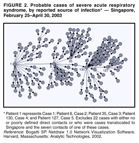
Network diagrams are frequently used to illustrate the transmission and spread patterns during an epidemic. The following network diagram illustrates some aspects of the transmission during the SARS outbreak in Singapore in 2003. Source: Centers for Disease Control and Prevention. Severe Acute Respiratory Syndrome - Singapore, 2003. MMWR 2003; 52: 405-409.
References
- ↑ Altman DG. Practical statistics for medical research. London: Chapman & Hall; 1991.
- ↑ 2.0 2.1 Fletcher J. Continuous variables. BMJ 2008; 337:a196 doi: 10.1136/bmj.a196
- ↑ Altman DG. Practical statistics for medical research. London: Chapman & Hall; 1991. p33
- ↑ 4.0 4.1 StatTools (http://amchang.net/StatTools/ForestPlot_Exp.php)
- ↑ Lewis S, Clarke M. Forest plots: trying to see the wood and the trees. BMJ 2001; 322 : 1479 doi: 10.1136/bmj.322.7300.1479
FEM PAGE CONTRIBUTORS 2007
- Editor
- Agnes Hajdu
- Original Author
- Alain Moren
- Contributors
- Lisa Lazareck
- Agnes Hajdu
Root > Assessing the burden of disease and risk assessment > Field Epidemiology > Outbreak Investigations > Informing Action / Improving Knowledge > Graphs, charts, diagrams
