Maps
Maps use geographic coordinates to locate events, for example, cases by place of onset or residence. Field epidemiologists frequently use maps to illustrate or analyse the occurrence of disease by place. Most maps contain these elements:
- Map Title
- Focuses attention on the primary content of the map, but may be omitted where captions are provided.
- Map Legend
- The principal symbol-referent description on the map; subordinate to the title, but a key element in map reading; describes all unknown symbols.
- Map Symbols
- Most important elements of the map, along with the geographical areas being shown. Symbols are the primary means for communicating on maps; they orient the reader on the map (what, where, when, why, etc.)
- Map Scale
- Usually included on a thematic map.
- Credits
- Map's data source, basemap source, reliability of data, dates, the map maker, and other explanatory text.
- Mapped and Unmapped Area
- The figure (what is being mapped) and the ground (the background).
- Graticule
- Lines of latitude and longitude are included if their locational information is crucial to the map's purpose
- Borders and Neatlines
- Borders serve to restrain eye movement; neatlines are finer and drawn inside borders, they are often used for decoration
Spot maps
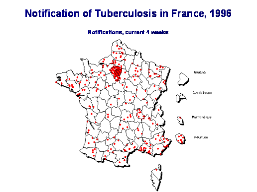
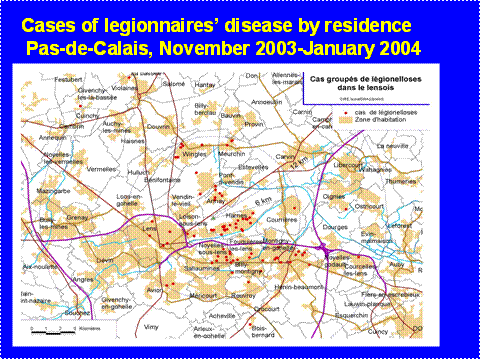
In a spot map, a dot or any other symbol on the map is located at the exact place the event occurred. This can be very precise when using the positing geographical system to locate events. A spot map is useful for locating an event, but since a spot map does not consider the size of a population, it does not allow showing the event's occurrence risk by place. Even when many dots are located in an area, it does not tell us if it simply reflects population density, risk of occurrence, or event.
Source: Denis Coulombier, InVS, France, 1996
Source: InVS, Saint Maurice, France
Area maps
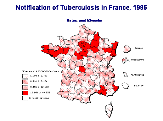
Area maps (also known as choropleth or thematic maps) use shaded or coloured areas to show counts, risks or rates of an event by area. A distinctive colour or shading is applied to artificial collection units (chorograms) in statistical or administrative areas. Shading or colour patterns are organised in a logical order. Usually, the darker the area, the higher the count, risk or rate. If risks or rates are used, they are computed for each area by taking into account the numerator (number of events in the area during a specific period of time) and the denominator (persons living in the area or person-time experienced by the area population). The range of the risk distribution by area is divided into exclusive categories and shaded/coloured accordingly. This map type displays aggregate data and allows for an easy, general comparison of neighbouring areas.
The following area map illustrates rates of tuberculosis cases in France in 1996. Rates are expressed as the number of new cases per 100 000 population per year. Differently, shaded coloured patterns are used to describe categories of magnitude of incidence rates in each of the 100 French health districts.
Source: InVS, Saint Maurice, France
Density maps
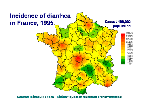
Density maps (also known as isarithmic, contour or intensity maps) allow for displaying disease occurrence over statistical units or administrative boundaries, therefore providing more details regarding the disease's geographical occurrence. Raw data (e.g. distribution) should not be mapped with this method, but instead derived values, such as densities. Changes in tone from dark to light reflect the density of disease; in this way, one may visualise the effective locations at risk.
See an example below that shows the incidence of diarrhoeal cases in France in 1995. Locations where most cases occurred are coloured dark red, while the darkest green parts represent the least cases.
FEM PAGE CONTRIBUTORS 2007
- Editor
- Agnes Hajdu
- Original Author
- Alain Moren
- Contributors
- Lisa Lazareck
- Agnes Hajdu
Root > Assessing the burden of disease and risk assessment > Field Epidemiology > Outbreak Investigations > Informing Action / Improving Knowledge


