Histograms
A histogram shows the frequency distribution of numerical data, either continuous (such as height) or discrete (such as mortality). With large amount of data, it is more convenient to create class intervals, and sort the data accordingly. Class interval is a statement of the actual range covered by a class. For example a particular class could have the class interval 5.5 to 6.5, and the adjacent class could have the class interval 6.5 to 7.5, and so on. [1] The horizontal axis displays the limits that are used for each interval. [2] Adjoining vertical columns centered on the midpoints are used to represent the number of observations in each class interval of the distribution. The surface of each column is proportional to the number of observations in the column. There should be no scale break on the x-axis otherwise the graph would not represent 100% of the data and surface units would no longer be proportional to the number of observations. Histograms can help visualise gaps in the data, outliners or other unusual observations.
In intervention epidemiology histograms are frequently used to present occurrence (distribution) of onsets of illness according to time. This is frequently called an epidemic curve even if it is not a curve.
Several principles apply:
- Time is represented on the x-axis.
- The choice of appropriate time interval depends on the duration of the epidemic and on the incubation period. As a general rule, the time unit on the x-axis should be less than one fourth of the incubation period.
- The x-axis begins showing time and any cases occurring before the outbreak. They can represent background cases or be index cases.
- Each member (case) is centred between the two tick marks limiting a time interval.
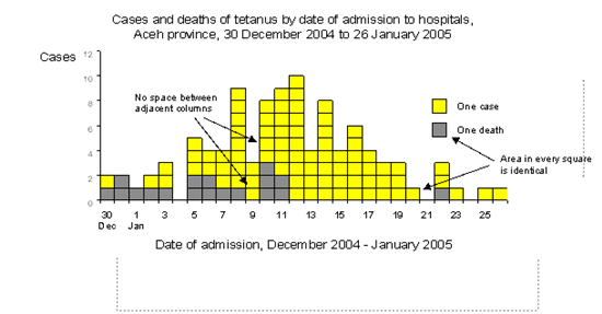
- One square represents one case. Using vertical or horizontal rectangles instead of squares would bias the interpretation of the shape of the curve by falsely creating or masking a peak.
- In the legend, we indicate beside a square what it represents (1 case).
The following histogram shows cases of tetanus reported after the Tsunami in Banda Aceh, Indonesia in 2004-2005.
Source: Prof. Leegross, WHO
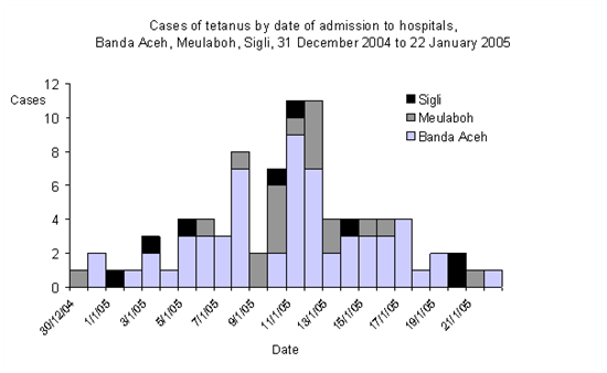
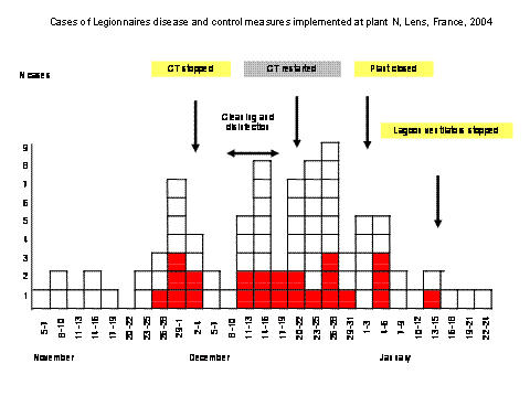
We may show a second or several additional variables on a histogram by shading the different components of a bar. However two many components in a bar may be difficult to interpret. In this case it is better to do one histogram for each component.
Source: Prof Leegross, WHO
Source: InVS, Saint Maurice, France
Histograms with unequal class interval can also be constructed. They are more difficult to create and to interpret. Whatever the interval, the unit of surface used should always be proportional to the amount of information (number of cases).
FEM PAGE CONTRIBUTORS 2007
- Editor
- Agnes Hajdu
- Original Author
- Alain Moren
- Contributors
- Maarten Hoek
- Lisa Lazareck
- Agnes Hajdu
Root > Assessing the burden of disease and risk assessment > Field Epidemiology > Outbreak Investigations > Informing Action / Improving Knowledge > Graphs, charts, diagrams


