Choosing an appropriate type of map
Contents
The choice of the appropriate type of map relies on the aim of the representation and the nature of the indicator to map.
Dot-density maps
In a dot-density map, each case that occurred in an area is represented as a dot on the map. Dot-density maps are best at representing the burden of disease by geographical areas, expressed as a count of cases. For rare diseases, dot maps are effective at detecting clustered cases. Dot-density maps are not indicated for representing rates or other composite indicators. They do not require classifying values in ranges; therefore, no information is lost in mapping.
Very few surveillance systems accurately record the exact address of residence of cases, allowing for precise positioning of case dots. Usually, the smallest geographical area available in the surveillance data is used for mapping, and dots are randomly located within these administrative boundaries. Using randomly located dots on large geographical areas can be particularly misleading, as cases seem to have occurred homogeneously throughout the area, even in locations known to be sparsely populated. An indication should be placed on the map to indicate the random location of the dots within area boundaries. The size of the dots should be such that dots do not overlap because of their number. When the disease is frequent, a dot can be assigned to several cases, e.g., 1 dot = 10 cases. An example of a dot-density map is presented in figure 1 in the chapter Analysis by place characteristics.
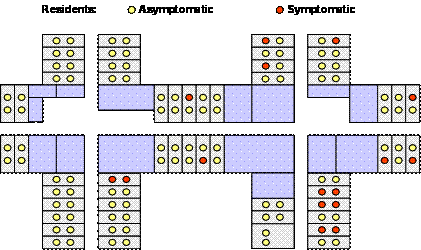
During outbreak investigations, dot maps can be used to represent cases of the disease which occurred during the outbreak, plotted by place of exposure. If the outbreak occurs in a closed environment, such as a cruise ship, a prison or a nursing home, cases can be plotted on a floor plan of the area (figure 1).
Figure 1: Distribution of residents by clinical status, Nursing home X, Delaware, USA, 1992.
Choropleth maps
In choropleth maps, geographical areas, usually defined by administrative boundaries, are filled with color or pattern to reflect the magnitude of the indicator to be mapped. Choropleth maps are popular because of their visual and intuitive appeal. However, careful thought should be given to designing the map as the level of aggregation, the mode of classification, the number of categories, and the choice of colors may hide meaningful spatial patterns or create artifactual ones.
Choice of the level of geographical aggregation Whenever crude rates, age and/or sex-specific rates, or standardized rates are plotted, the numerator and denominator data need to be aggregated by geographical areas. Administrative boundaries are generally used since denominators are usually available with sufficient details. However, the choice of the administrative level should avoid resulting in too few cases reported in each area that would result in wide variations of rates. Calculating rates when less than 20 cases contribute to the numerator is not advisable. Therefore, a balance must be struck between the size of the geographical area and the period during which cases are accumulated to avoid such small figures.
Classification
Affecting a color or a pattern to a geographical area requires that data are organized into categories. Four to eight categories are used in general. Too few categories result in a loss of information, while too many may result in difficulties in perception. In addition, there should not be too many categories when the map includes relatively few geographical units.
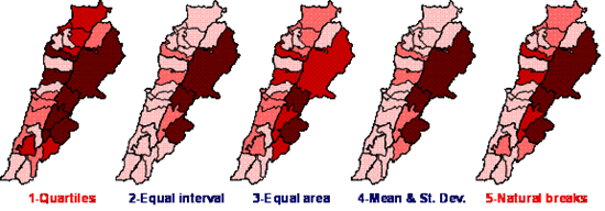
Most mapping software offer several approaches to classifying data. Selecting the appropriate classification method requires inspecting the distribution of values across geographical areas (figure 2). The most commonly used classification methods include:
Equal count classification
This type of classification attempts to assign an equal number of observations in each category. Quartiles of the distribution are used for four categories, quintiles for five. While this method is popular and commonly used, it may classify areas with close values in different groups and areas with dissimilar values in the same categories based solely on ranks. It is best used for evenly- or normally- distributed data.
Equal interval classification
This classification applies equal amplitude ranges to data. Therefore, it is indicated when values of the geographical areas are evenly distributed, resulting in a straight line on the distribution plot (figure 2) and an equal number of areas in each category. It should not be used when the distribution is skewed or includes outliers since it may result in categories not being represented on the map (as in figure 3, map 2).
Equal area classification
Equal area classification attempts to classify data so that each class is represented by an equal area on the map. Caution should be used with this method when population density varies greatly across areas: large underpopulated areas may appear in two categories in relation to their large size although their values may be very similar.
Mean and standard deviation classification
This classification method assigns categories on both sides of the mean using standard deviations (e.g., 1,-2, -3 standard deviations under the mean, +1, +2, +3 standard deviations above the mean). This is a statistical classification method best indicated if the distribution of values follows a normal distribution. It shows how area values differ from the average value. It is not indicated when the distribution of values is skewed and may result in categories not being represented on the map (as in figure 3, map 4).
Natural breaks classification
This method attempts to regroup values by minimizing the variance within categories and maximizing the variance between categories. It tends to regroup similar values together to best represent the distribution.
In conclusion, equal count or equal interval classifications can be used whenever values are evenly distributed. When values are normally distributed, mean and standard deviation classification should be used. In other instances, natural breaks should be preferred, as this method makes no assumptions about the shape of the distribution. Figure 3 shows an example of the effect of the classification method selected.
Figure 2: Distribution of values and ranges of the classification methods, brucellosis notification in Lebanon, by district, 52 weeks rate, as of week 15 of 2003
1: quartiles, 2: equal interval, 3: equal area, 4: mean and standard deviation, 5: natural breaks
Figure 3: Distribution of brucellosis notification in Lebanon, by district, 52 weeks rate, as of week 15 of 2003
Grey shades and colors
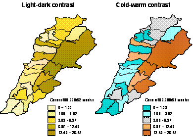
Choropleth maps use an analogy to represent the data. Caution should be used in assigning shades and colors to classification areas. Risks of transmission expressed as crude, specific or standardized rates, are quantitative in nature. Therefore, a light-dark color contrast should be preferred to represent it. A gradient of grey (black and white display) or of color (color display), such as yellow or red, is indicated.
The cold-warm contrast from cyan to orange can effectively represent values below and over a mean, as exemplified in figure 4. While the cold-warm contrast effectively represents the opposition between high and low values, it does not appropriately represent the range of values when printed or duplicated in black and white. In addition, it may pose problems to a person with color blindness.
Figure 4: Distribution of brucellosis in Lebanon, by district, 52 weeks rate, as of week 15 of 2003
Isopleth maps
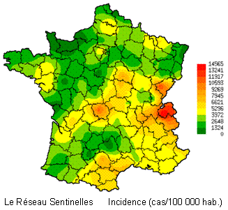
Figure 5: Incidence of flu-like illness in France, 2002
Source: INSERM Unit U 444, Epidemiology and information sciences
Isopleth maps (figure 5) do not require aggregating values by geographical areas but instead use the data itself to define geographical areas with similar values. It is indicated to represent continuous data that varies progressively over geographical locations, e.g., temperature and elevation. In surveillance, isopleth maps are indicated to represent incidence when surveillance is based on a sample of sentinel sites. Shaded or colored area boundaries are derived from the data using statistical methods such as kriging [1].
Mapping place and time
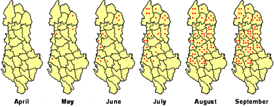
Displaying the location and time characteristics of the distribution of a disease is a very effective way to grasp the disease transmission dynamic. This is best achieved by plotting subsequent maps next to each other, as exemplified in figure 6.
Figure 6: Distribution of polio cases by district, Albania, April to September 1996
Additional information can be found in the "Handbook on geographic information systems and digital mapping" from UNSTAT [2]
References
- ↑ CARRAT F, VALLERON A-J Epidemiologic MappingUsing the "Kriging" Method. Application to an Influenza-Like Illness epidemic in France. Am. J. Epidemiol., 1992; 135:1293-1300.
- ↑ http://unstats.un.org/unsd/publication/SeriesF/SeriesF_79E.pdf
FEM Editor 2007
- Denis Coulombier
Original FEM authors
- Christophe Paquet
- Arnold Tarantola
- Philippe Quenel
- Nada Ghosn
Contributors
- Lisa Lazareck
- Denis Coulombier
- Vladimir Prikazsky
Root > Assessing the burden of disease and risk assessment > Descriptive data analysis > Analysis by place characteristics
