Pie charts
A pie chart is a circular chart that is split into segments which show components of a larger group. Pie charts are suitable for displaying categorical (qualitative) data, or discrete data in distinct categories. The size of a given "slice" is proportional to the amount of data (e.g. number of cases) it represents. However small differences between components are more difficult to see than differences between bars on a bar graph. This is why the proportion (%) of the total that each component represents is frequently added on the slice. Different shading or colours can also be used to identify the various slices. It is useful to order the components by decreasing or increasing magnitude. This can also be supported by a regular darkening gradient of a colour.
Use of the pie chart is quite popular, as the circle provides a visual concept of the whole (100%) and they are simple to use. Despite its popularity, pie charts should be used sparingly. First, they are best used for displaying statistical information when there are no more than six components only, otherwise the resulting picture will be too complex to understand [1]. Second, pie charts are not useful when the values of each component are similar because it is difficult to see the differences between slice sizes [1]. Third, pie charts can be very misleading if one presents percentages based on a limited number of cases (e.g. if you want to show the distribution of different sources in 21 Camplyobacter outbreaks, do not illustrate it using a pie chart where a single outbreak caused by bakery products would "represent" 4.8% of the total).
Examples for pie charts:
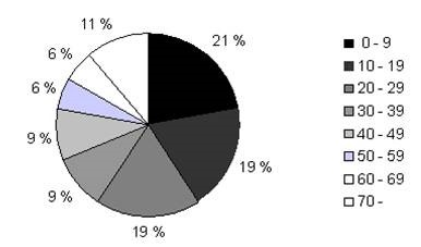
Figure 1. Cases of S. Typhimurium infection by age-group, Herøy, Norway, 1999
Data source: Norwegian Institute of Public Health, Oslo, Norway
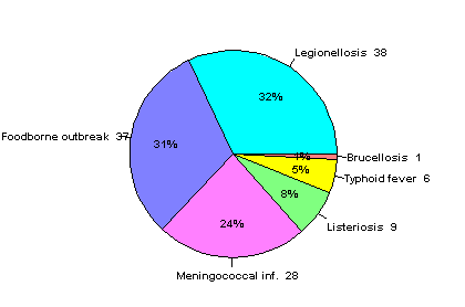
Figure 2. Distribution of notifiable diseases reported during the World football cup, 4 June - 10 July 1998
Data source: Norwegian Institute of Public Health, Oslo, Norway
FEM PAGE CONTRIBUTORS 2007
- Editor
- Agnes Hajdu
- Original Author
- Alain Moren
- Contributors
- Lisa Lazareck
- Katrine Borgen
- Agnes Hajdu

