Line graphs: Difference between revisions
Bosmana fem (talk | contribs) (Created page with " Category:Graphs, charts, diagrams") |
Bosmana fem (talk | contribs) mNo edit summary |
||
| Line 1: | Line 1: | ||
In epidemiology we typically use rectangular coordinates. They include a vertical and a horizontal line with specific units of measurements and which intersect at a right angle. These are the x (horizontal) and y (vertical) axes. The scale used for x is arithmetic. Scales used for y can be arithmetic or logarithmic. Each point on a graph represents a relationship and is determined by a pair of numbers containing two coordinates (x and y). We usually express y according to values of x. X (also called independent variable) usually represents classes of x or time. Y (the dependent variable) represents counts, proportions or rates. | |||
Line graphs are suitable for displaying numerical (quantitative) data. | |||
==Arithmetic line graphs== | |||
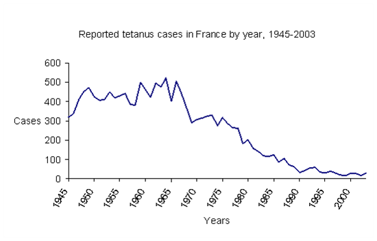
An arithmetic line graph shows distribution of an event (y) according to x (frequently time in epidemiology). Several events, several series of data, can be shown on the same line graph. The scale used on the x-axis depends on the interval (time) used to collect data. The y unit of measurement depends on the magnitude of the highest value for y. An example of a line graph showing the number of tetanus cases reported in France from 1945 to 2003 is shown below. | |||
[[File:0363.image002.gif-550x0.png|1200px|frameless|center]] | |||
Data source: InVS, Saint Maurice, France | |||
Tips to select scales on the axes: | |||
* Select a y-axis shorter than the x-axis. The graph will then be horizontal (ratio length y-axis / length x-axis = 3/5). | |||
* Always start the y-axis with 0. | |||
* Determine the range of value needed on the y-axis by identifying the highest y value in the data set. | |||
* Choose then an interval on the y-axis which fits with the range (an interval size which will give enough intervals and show enough details). | |||
* If y values are missing for one or several values of x, the line graph should be interrupted accordingly and started again after the gap. However the x and y axes should stay continuous (e.g. on the x-axis time should always be proportional to distance from zero). | |||
* If large differences in rates must be shown, consider using a box inset into the graph to show a portion of the line at a different scale [1]. | |||
The following graph is incorrect since the x-axis is interrupted and there is a "time gap". | |||
[[File:0285.image003.gif-550x0.png|1200px|frameless|center]] | |||
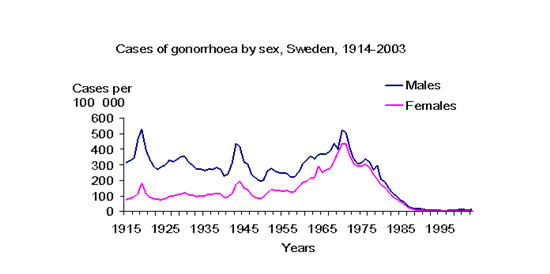
Arithmetic line graphs can show several categories of the same characteristic (age groups) on the same graph. The following example shows reported incidence rates of gonorrhoea in Sweden by sex. | |||
[[File:7206.image005.gif-550x0.png|1200px|frameless|center]] | |||
Data source : SMI, Solna, Sweden | |||
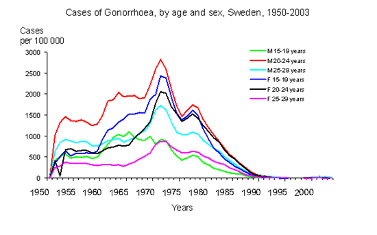
However, it is difficult to show many series of data on the same line graph. The following example is a further breakdown of the above data into six age groups. Interpretation is becoming more difficult. | |||
[[File:0363.image007.gif-550x0.png|1200px|frameless|center]] | |||
Data source : SMI, Solna, Sweden | |||
==Semilogarithmic-scale line graphs== | |||
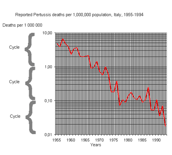
If we use a logarithmic scale on the y-axis and if the x-axis remains the same (arithmetic scale), we create a semi-logarithmic scale line graph. With a logarithmic scale on the y-axis we represent the relative change of y over time rather than its absolute change over time. Semi-logarithmic scale line graphs are used to present and interpret rates of change over time rather than magnitude of change. They also allow showing very different magnitudes and ranges of rates between two lines (e.g. high incidence and low mortality rates for the same disease). | |||
Semi-logarithmic scale paper: | |||
*On the y-axis, intervals are logarithmic and no longer arithmetic. | |||
* There are several cycles of tick marks on the y-axis. Each corresponds to an equal distance on the y-axis. | |||
* The values of one cycle are 10 times greater than the values of the previous cycle. | |||
* Within a cycle the 10 tick marks are not equally distant (distance from 2 to 3 is different than distance from 3 to 4). Their progression is geometric, not arithmetic. | |||
* The y axis can cover a large range of y values. | |||
The following characteristics are noteworthy: | |||
* The slope of the line indicates the rate of change (the relative change) of y over time. | |||
* A horizontal straight line indicates no change. | |||
* An upward or downward straight line slope indicates a constant rate of increase or decrease in the measured indicator (e.g. rate) over time. | |||
* Two parallel lines indicate similar rate of change over time. | |||
[[File:7077.image009.gif-550x0.png|1200px|frameless|center]] | |||
Source: Isituto Superiore di Sanita, Rome, Italy | |||
The following example shows occurrence of cases and deaths of measles in England and Wales from 1940 to 2002. On an arithmetic-scale line graph it is impossible to see the trend in death rates over time. The different magnitude of rates between incidence and mortality does not allow showing both on the same graph. The solution is to use a logarithmic scale for the y-axis. Doing so, we allow very different rates to be shown. | |||
On arithmetic-scale line graph: | |||
[[File:0523.image011.gif-550x0.png|1200px|frameless|center]] | |||
On semi-logarithmic-scale line graph: | |||
[[File:1524.measles log.jpg-550x0.jpg|1200px|frameless|center]] | |||
Data source : CDSC, HPA, Colindale, UK | |||
Another example shows cases and deaths from Poliomyelitis in France between 1945 and 1973. | |||
On arithmetic-scale line graph: | |||
[[File:2746.image015.gif-550x0.png|1200px|frameless|center]] | |||
On semi-logarithmic-scale line graph: | |||
[[File:5265.image017.gif-550x0.png|1200px|frameless|center]] | |||
Data source: InVS, Saint Maurice, France | |||
The decision to use arithmetic or semi-logarithmic-scale line graphs depends on what we want to show, absolute magnitudes or rates of change over time. | |||
==FEM PAGE CONTRIBUTORS 2007== | |||
;Editor | |||
:Agnes Hajdu | |||
;Original Author | |||
:Alain Moren | |||
;Contributors | |||
:Lisa Lazareck | |||
:Agnes Hajdu | |||
[[Category:Graphs, charts, diagrams]] | [[Category:Graphs, charts, diagrams]] | ||
Latest revision as of 07:55, 29 March 2023
In epidemiology we typically use rectangular coordinates. They include a vertical and a horizontal line with specific units of measurements and which intersect at a right angle. These are the x (horizontal) and y (vertical) axes. The scale used for x is arithmetic. Scales used for y can be arithmetic or logarithmic. Each point on a graph represents a relationship and is determined by a pair of numbers containing two coordinates (x and y). We usually express y according to values of x. X (also called independent variable) usually represents classes of x or time. Y (the dependent variable) represents counts, proportions or rates.
Line graphs are suitable for displaying numerical (quantitative) data.
Arithmetic line graphs
An arithmetic line graph shows distribution of an event (y) according to x (frequently time in epidemiology). Several events, several series of data, can be shown on the same line graph. The scale used on the x-axis depends on the interval (time) used to collect data. The y unit of measurement depends on the magnitude of the highest value for y. An example of a line graph showing the number of tetanus cases reported in France from 1945 to 2003 is shown below.
Data source: InVS, Saint Maurice, France
Tips to select scales on the axes:
- Select a y-axis shorter than the x-axis. The graph will then be horizontal (ratio length y-axis / length x-axis = 3/5).
- Always start the y-axis with 0.
- Determine the range of value needed on the y-axis by identifying the highest y value in the data set.
- Choose then an interval on the y-axis which fits with the range (an interval size which will give enough intervals and show enough details).
- If y values are missing for one or several values of x, the line graph should be interrupted accordingly and started again after the gap. However the x and y axes should stay continuous (e.g. on the x-axis time should always be proportional to distance from zero).
- If large differences in rates must be shown, consider using a box inset into the graph to show a portion of the line at a different scale [1].
The following graph is incorrect since the x-axis is interrupted and there is a "time gap".
Arithmetic line graphs can show several categories of the same characteristic (age groups) on the same graph. The following example shows reported incidence rates of gonorrhoea in Sweden by sex.
Data source : SMI, Solna, Sweden
However, it is difficult to show many series of data on the same line graph. The following example is a further breakdown of the above data into six age groups. Interpretation is becoming more difficult.
Data source : SMI, Solna, Sweden
Semilogarithmic-scale line graphs
If we use a logarithmic scale on the y-axis and if the x-axis remains the same (arithmetic scale), we create a semi-logarithmic scale line graph. With a logarithmic scale on the y-axis we represent the relative change of y over time rather than its absolute change over time. Semi-logarithmic scale line graphs are used to present and interpret rates of change over time rather than magnitude of change. They also allow showing very different magnitudes and ranges of rates between two lines (e.g. high incidence and low mortality rates for the same disease).
Semi-logarithmic scale paper:
- On the y-axis, intervals are logarithmic and no longer arithmetic.
- There are several cycles of tick marks on the y-axis. Each corresponds to an equal distance on the y-axis.
- The values of one cycle are 10 times greater than the values of the previous cycle.
- Within a cycle the 10 tick marks are not equally distant (distance from 2 to 3 is different than distance from 3 to 4). Their progression is geometric, not arithmetic.
- The y axis can cover a large range of y values.
The following characteristics are noteworthy:
- The slope of the line indicates the rate of change (the relative change) of y over time.
- A horizontal straight line indicates no change.
- An upward or downward straight line slope indicates a constant rate of increase or decrease in the measured indicator (e.g. rate) over time.
- Two parallel lines indicate similar rate of change over time.
Source: Isituto Superiore di Sanita, Rome, Italy
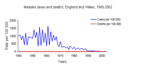
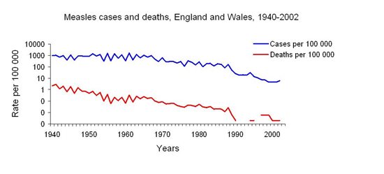
The following example shows occurrence of cases and deaths of measles in England and Wales from 1940 to 2002. On an arithmetic-scale line graph it is impossible to see the trend in death rates over time. The different magnitude of rates between incidence and mortality does not allow showing both on the same graph. The solution is to use a logarithmic scale for the y-axis. Doing so, we allow very different rates to be shown.
On arithmetic-scale line graph:
On semi-logarithmic-scale line graph:
Data source : CDSC, HPA, Colindale, UK
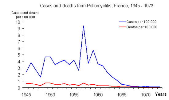
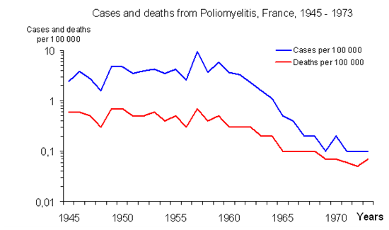
Another example shows cases and deaths from Poliomyelitis in France between 1945 and 1973.
On arithmetic-scale line graph:
On semi-logarithmic-scale line graph:
Data source: InVS, Saint Maurice, France
The decision to use arithmetic or semi-logarithmic-scale line graphs depends on what we want to show, absolute magnitudes or rates of change over time.
FEM PAGE CONTRIBUTORS 2007
- Editor
- Agnes Hajdu
- Original Author
- Alain Moren
- Contributors
- Lisa Lazareck
- Agnes Hajdu
