Bar graphs: Difference between revisions
Bosmana fem (talk | contribs) mNo edit summary |
Bosmana fem (talk | contribs) |
||
| (One intermediate revision by the same user not shown) | |||
| Line 23: | Line 23: | ||
Data source: Norwegian Institute of Public Health, Oslo, Norway | Data source: Norwegian Institute of Public Health, Oslo, Norway | ||
= | <div style="display: inline-block; width: 25%; vertical-align: top; border: 1px solid #000; background-color: #d7effc; padding: 10px; margin: 5px;"> | ||
'''FEM PAGE CONTRIBUTORS 2007''' | |||
;Editor | ;Editor | ||
:Agnes Hajdu | :Agnes Hajdu | ||
| Line 32: | Line 33: | ||
:Maarten Hoek | :Maarten Hoek | ||
:Agnes Hajdu | :Agnes Hajdu | ||
</div> | |||
[[Category:Graphs, charts, diagrams]] | [[Category:Graphs, charts, diagrams]] | ||
Latest revision as of 18:44, 10 April 2023
Bar graphs (or bar charts) are displaying information using only one coordinate. Bar graphs are suitable for displaying categorical (qualitative) data. They are also used to compare discrete data in distinct categories.
Simple bar graph
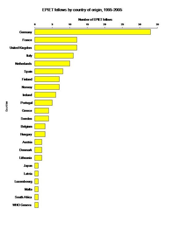
The simplest bar graph displays data from a table with one variable. Each bar represents one category. Bar graphs can be organised horizontally or vertically. Vertical bars differ from histograms since they are separated by a space. The height of the bar is proportional to the number of events (e.g. cases) in the category, nevertheless the surface is not always proportional to the width of the category on the x-axis (e.g. different width of age groups). If there is a logical order between categories it should be respected. Otherwise categories can be organised along decreasing or increasing values of respective bars. Variables in a bar graph can be discrete (e.g. sex, region, race) or continuous (e.g. age) but organised in categories (e.g. age groups). The x axis does not need to be continuous. The following horizontal bar graph shows distribution of EPIET fellows by country of origin.
Source: European Programme for Intervention Epidemiology Training (EPIET)
Grouped bar graphs
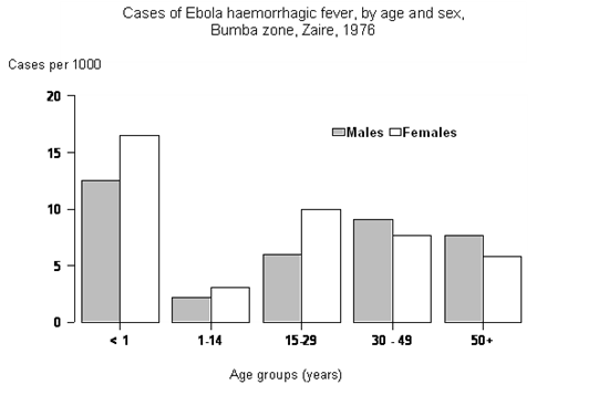
Sometimes several subcategories can be shown and placed close to each other in a larger category (grouped bar graphs). It is important that information should be presented in the same order in each category. The following vertical grouped bar graph represents the distribution of cases of Ebola haemorrhagic fever in Bumba zone, Zaire in 1976. The graphic shows two variables, age groups and sex.
Stacked bar graphs
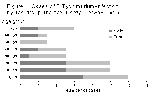
An alternative to grouped bar graphs is the stacked bar graph (also known as sub-divided bar graph). On this type of graph a bar is divided into components, it shows segments of totals. The height of each component is proportional to the part it takes in the bar. Similarly to grouped bar graphs, information should be presented in the same sequence on each bar. The following stacked bar graph shows the distribution of cases of Salmonella Typhimurium infection by age and sex in Norway. In each age group category the bar is divided into two sub-categories, males and females.
Data source: Norwegian Institute of Public Health, Oslo, Norway
Component bar graphs
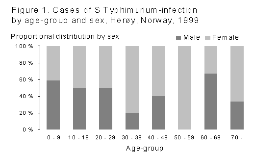
Component bar graphs (also called proportional component bar graphs) are different from stacked bar graphs in the sense that they represent proportions rather than absolute values. Each bar has the same height and represents 100% of the data in that bar. Bar components are expressed as the percentage of the total bar they represent. The following 100% component bar graph shows the same data as above. Proportions are visible but the absolute magnitude of the distribution is no longer visible.
Data source: Norwegian Institute of Public Health, Oslo, Norway
FEM PAGE CONTRIBUTORS 2007
- Editor
- Agnes Hajdu
- Original Author
- Alain Moren
- Contributors
- Lisa Lazareck
- Maarten Hoek
- Agnes Hajdu


