Category:Analysis by place characteristics: Difference between revisions
Bosmana fem (talk | contribs) |
Bosmana fem (talk | contribs) |
||
| (One intermediate revision by the same user not shown) | |||
| Line 31: | Line 31: | ||
* Defining the [[Which indicator to map?|appropriate indicator]] to represent the magnitude of the disease | * Defining the [[Which indicator to map?|appropriate indicator]] to represent the magnitude of the disease | ||
* Selecting the appropriate variable to display the spatial disease pattern | * Selecting the appropriate variable to display the spatial disease pattern | ||
* [[Choosing | * [[Choosing an appropriate type of map]] | ||
==References== | ==References== | ||
<references/> | <references/> | ||
= | <div style="display: inline-block; width: 25%; vertical-align: top; border: 1px solid #000; background-color: #d7effc; padding: 10px; margin: 5px;"> | ||
Denis Coulombier | '''FEM PAGE CONTRIBUTORS 2007''' | ||
; Original FEM Authors | ;FEM Editor | ||
: Christophe Paquet | :Denis Coulombier | ||
: Arnold Tarantola | ;Original FEM Authors | ||
: Philippe Quenel | :Christophe Paquet | ||
: Nada Ghosn | :Arnold Tarantola | ||
:Philippe Quenel | |||
:Nada Ghosn | |||
;FEM Contributors -2017 | ;FEM Contributors -2017 | ||
: Lisa Lazareck | :Lisa Lazareck | ||
: Farshad Pourmalek | :Farshad Pourmalek | ||
: Denis Coulombier | :Denis Coulombier | ||
: Arnold Bosman | :Arnold Bosman | ||
: Vladimir Prikazsky | :Vladimir Prikazsky | ||
</div> | |||
[[Category:Descriptive data analysis]] | [[Category:Descriptive data analysis]] | ||
Latest revision as of 08:58, 23 April 2023
Visualizing geography
Plotting surveillance data by geographical location is an important step of descriptive analysis. When done properly, this method enables the visualization of the geographical extension of a public health event, the identification of disease clusters, and the targeting of affected populations.
Data can be expressed in absolute numbers or rates (incidence, attack rates). Using rates allows for comparing distributions across geographic boundaries (based on places of disease notification). However, standardizing rates by age may sometimes be necessary to compare areas with different population structures (i.e., younger urban vs. older rural population).
The level of geographical analysis depends on the public health event under consideration. A cluster of rare diseases can only be described at the level of the affected community, while the national picture is of interest for diseases more commonly distributed.
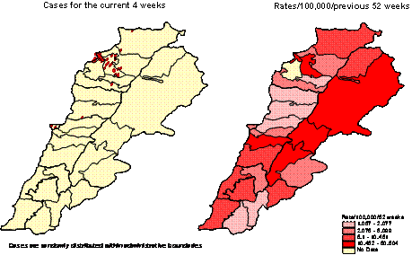
Figure 1: Distribution of viral hepatitis in Lebanon, by district, as of week 2003-15.
Because they are available and denominators are known, administrative boundaries are often used for analyzing surveillance data. In addition, they reflect the structure through which the response to a public health crisis will be implemented. It is important, however, to remember that in some instances, they may distort the true distribution of a disease in a population (e.g., when a city is split over several administrative boundaries, diluting any increase in reporting among several places).
Mapping data issued from sentinel surveillance systems requires specific techniques to extrapolate the information from sentinel sites to the entire country [1].
See additional information on mapping surveillance data in chapters Choosing an appropriate type of map and Which indicator to map
Spatial distribution of diseases
Analyzing the spatial distribution of communicable diseases is an important step in the routine analysis of surveillance data. About early warning functions, it explores whether the spatial distribution of the disease follows some geographical pattern that may contribute to identifying areas at increased risk of transmission. During outbreak investigations, mapping cases help generate hypotheses about the transmission mode.
The spatial distribution of communicable diseases relates to their mode of transmission:
- Communicable diseases related to a point common source are likely to show spatial clustering. For example, a cluster of infected people is likely exposed to a common source, such as a water supply system contaminated by enteric germs or a cooling tower contaminated with legionella.
- Other communicable diseases transmitted from person to person can also show spatial clustering when people are infected by exposure to existing cases. Viral hepatitis and meningitis are examples of such diseases.
However, some communicable diseases are unlikely to show meaningful spatial patterns. This is the case, for example:
- Communicable diseases that are associated with travel, especially when the incubation period is long enough to allow the traveler to leave the area of exposure before becoming ill, e.g., viral hepatitis or travel-associated Legionnaire disease.
- Communicable diseases related to a widespread common source, such as a food product having a broad distribution in a country.
Steps in mapping data
A map is an analog way to represent the spatial distribution of a disease. Making a meaningful map requires the following steps:
- Defining the appropriate indicator to represent the magnitude of the disease
- Selecting the appropriate variable to display the spatial disease pattern
- Choosing an appropriate type of map
References
- ↑ Carrat F., Valleron A-J.: Epidemiologic Mapping Using the "Krigging" Method. Application to an Influenza-Like Illness epidemic in France. Am. J. Epidemiol., 1992; 135:1293-1300
FEM PAGE CONTRIBUTORS 2007
- FEM Editor
- Denis Coulombier
- Original FEM Authors
- Christophe Paquet
- Arnold Tarantola
- Philippe Quenel
- Nada Ghosn
- FEM Contributors -2017
- Lisa Lazareck
- Farshad Pourmalek
- Denis Coulombier
- Arnold Bosman
- Vladimir Prikazsky
Pages in category "Analysis by place characteristics"
The following 2 pages are in this category, out of 2 total.
