Category:Analysis by time characteristics: Difference between revisions
Bosmana fem (talk | contribs) (Created page with "Temporal analysis of routine surveillance data uses graphical representation, usually plotted by time of onset. However, the onset time may give a false impression of a decrea...") |
Bosmana fem (talk | contribs) mNo edit summary |
||
| Line 5: | Line 5: | ||
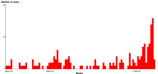
Figure 1: Distribution of viral hepatitis in Lebanon, by weeks, as of week 2003-15 | Figure 1: Distribution of viral hepatitis in Lebanon, by weeks, as of week 2003-15 | ||
[[File:HAV Time Lebanon.png| | [[File:HAV Time Lebanon.png|none|600px]] | ||
Counts of notifications are generally used. Alternatively, rates (cases * 100,000 / population) are preferred when the population is unstable over time. Graphs are produced for the national | Counts of notifications are generally used. Alternatively, rates (cases * 100,000 / population) are preferred when the population is unstable over time. Graphs are produced for the national, intermediate, or peripheral levels, usually weekly. | ||
The graph's visual review aims to detect aberrations in the data, such as changes in trends, depicting the increase in person-to-person transmission or peaks related to potential point source outbreaks. Thresholds can be set for certain health events to detect areas in which notified cases or rates exceed some pre-defined values. However, for other diseases, testing for the statistical significance of these changes in notification patterns requires a statistical calculation to quantify the departure from historical values. These methods are detailed in the chapter Methods for setting thresholds in time series analysis. | The graph's visual review aims to detect aberrations in the data, such as changes in trends, depicting the increase in person-to-person transmission or peaks related to potential point source outbreaks. Thresholds can be set for certain health events to detect areas in which notified cases or rates exceed some pre-defined values. However, for other diseases, testing for the statistical significance of these changes in notification patterns requires a statistical calculation to quantify the departure from historical values. These methods are detailed in the chapter Methods for setting thresholds in time series analysis. | ||
Revision as of 14:34, 18 December 2022
Temporal analysis of routine surveillance data uses graphical representation, usually plotted by time of onset. However, the onset time may give a false impression of a decreasing trend in the most recent time units because of reporting delays. If delays are known to occur, the time of notification should be preferred.
Appropriate graphs for time data include histograms (or joint bars) and line charts. The histograms must be limited to enumerated data (count of cases) and not used for rates for which line charts are preferred.
Figure 1: Distribution of viral hepatitis in Lebanon, by weeks, as of week 2003-15
Counts of notifications are generally used. Alternatively, rates (cases * 100,000 / population) are preferred when the population is unstable over time. Graphs are produced for the national, intermediate, or peripheral levels, usually weekly.
The graph's visual review aims to detect aberrations in the data, such as changes in trends, depicting the increase in person-to-person transmission or peaks related to potential point source outbreaks. Thresholds can be set for certain health events to detect areas in which notified cases or rates exceed some pre-defined values. However, for other diseases, testing for the statistical significance of these changes in notification patterns requires a statistical calculation to quantify the departure from historical values. These methods are detailed in the chapter Methods for setting thresholds in time series analysis.
Smoothing techniques, such as averaging values over a rolling period (moving averages), are useful to characterize trends and seasonality. Using an averaging period of:
5 to 15 weeks highlights the seasonal pattern of the event by smoothing the variations occurring from one week to the next. 52 weeks highlights the secular trend in the data by averaging the seasonal effect across the averaging time period See Annex 1, page 7, for further information on using simple smoothing techniques to describe the components of time series. Due to its nature, analysis of case-based surveillance time characteristics is subject to limitations. Surveillance is an evolving process that can be affected by: Change in case definitions as new tests become available Enrolment of new sources of data Increase in the completeness of reporting following a sensitization campaign Enhancement of surveillance in the event of an outbreak, Each of these approaches induces limitations in using historical data as a baseline against which alerts can be detected.
Pages in category "Analysis by time characteristics"
The following 2 pages are in this category, out of 2 total.
